A responsive image is on that reshapes itself according to the size of a screen. This will be a tutorial for the Power Lead System on how to make a mobile responsive image within the Power Lead System simply.
First a non responsive image does not resize to the width of a device.
Full size of image non responsive.
Below is the image when it reshapes to the size of a browser or device note you lose parts of the image. Example: http://not-responsive.powerleadsystem.info/ on this page narrow your browser up and you will see the image doesn’t respond to the width of the page.
Here is a responsive example of an image that resizes according to the device width. note how the image resized to the with of the browser and that’s what it will do when it resizes on a mobile device. Link to Example: http://www.leadlightning.info/site/index.asp?DL=185166&page=383258

Here is an error that occurs within the Power Lead System’s editor when you click on a responsive image and replace it with another image. NOTE: I will be showing the fix at the bottom of this article. Link to see Example: http://error-responsive.powerleadsystem.info/

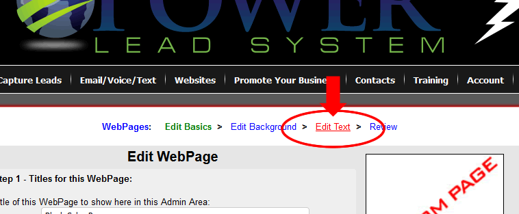
Now Let’s Start
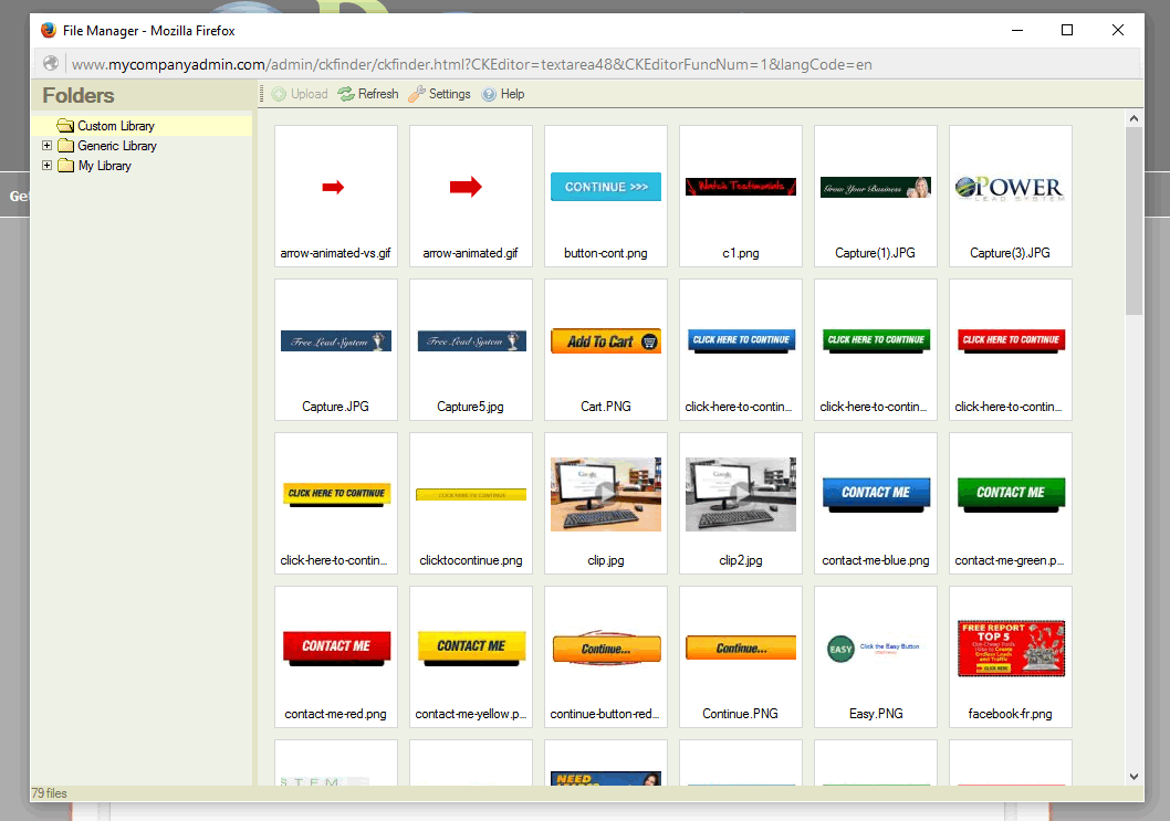
First: Sign into the Power Lead System’s back office. www.mycompanyadmin.com
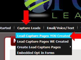
First roll over Capture Leads then select “Lead Capture Pages You Created”.
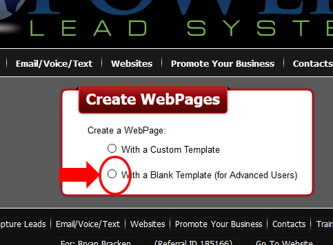
Next Page select “With a Blank Template (for Advanced Users) the page then will redirect to a Copied Blank html page in the editor.
On the next page then select “Edit”
Now on this page you can change edit and create html code either with WYSIWYG or by using the Source Code this is where you can modify and make a page that you create.
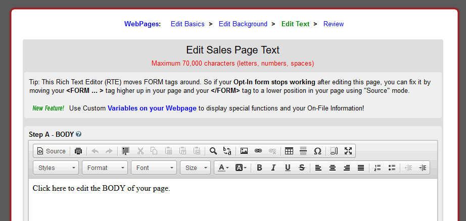
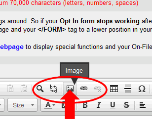
Now click on the Body area then go to the add/change image icon on the edit page.
Now a pop up box will come up. Now Click on Browse Server.
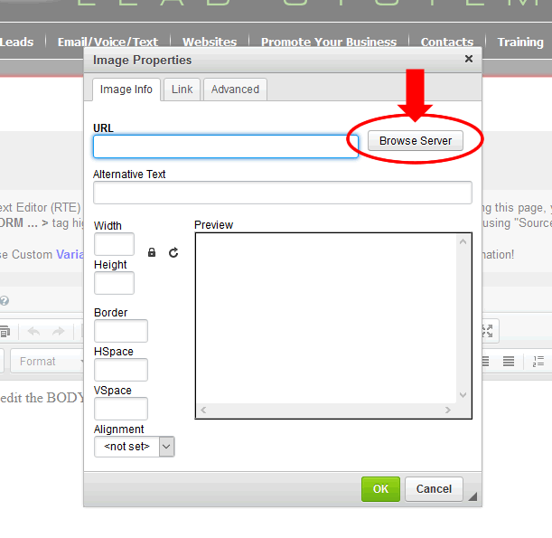
Another box will pop up. Here you can either select an image in the Custom Library folder or Upload an image to your folder called MY LIBRARY. For illustration purposes I will be using the Custom Library Folder. You will want to select an image.
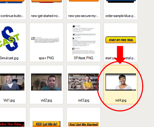
When you select the image you want then double click on it or enter this box will disappear and another box will pop up.
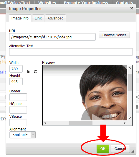
On this box you just need to click OK to add the image into the editor.
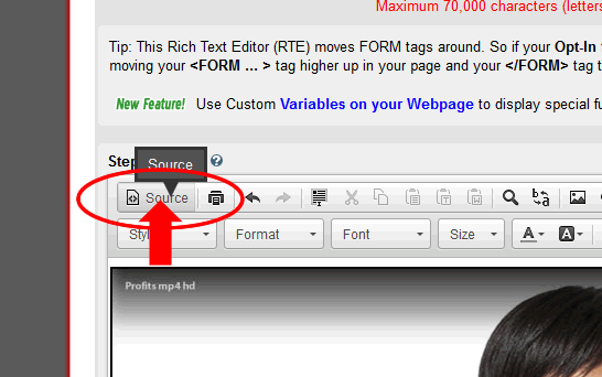
When the editor again shows you will see your image on the page. Next select and click “SOURCE”.
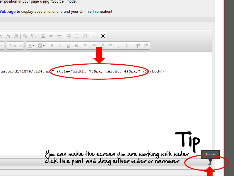
TIP: To widen or narrow the work area for the Source Code Look near the bottom you will see a small triangle click and drag wider or narrower to suite your taste see the below image.
Now look for the html code for where it says “style=” we are going to change the width and height information to make this image responsive.
“width” will change to “max-width” and the number with px following it will change to “100%” so in the below image you see “width: 798px;” this will change to “max-width:100%;”
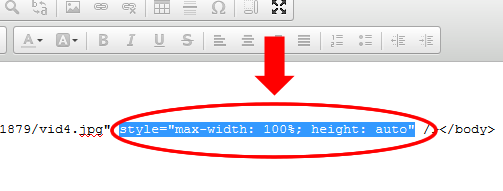
Next the “height: 443px;” will change to “height: auto;”
style=”max-width:100%;height:auto;” This is what the code should look like when it is changed.
So the code will look like this for the image.
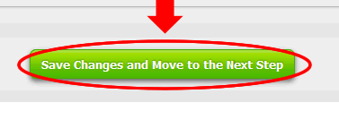
Now when you are finished with the edit then click “Save Changes and Move to the Next Step”
Now view your page and you will see that the image is now responsive.
HOW TO FIX AN ERROR WHEN REPLACING THE IMAGE WITH ANOTHER IMAGE.
Some of you know that the Power Lead System’s editor does change code on you and here is the fix when you are swapping out anther image for the image you have made responsive.
The error looks something like this:
Note the image is squished when it is narrowed up.
Here is how to fix that error.
You would have added an image from the Image Library by Browsing the Server.
Once added and back to the Editor then Select and click “SOURCE”.
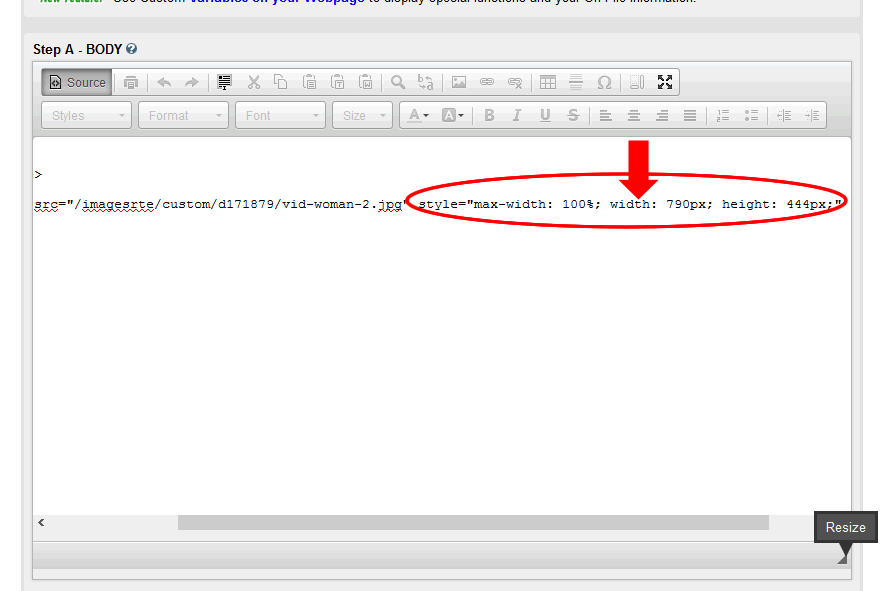
Note that the code has changed from what we originally had height was changed back to a numeric value instead of auto and width was added again.
We need to change that back to what we originally changed the image to style to: style=”max-width:100%;height:auto;” This is what the code should look like when it is changed.
To finish then click the “Save Changes and Move to the Next Step.

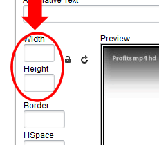
NOTE: In the image pop up box for the original image the image that will change note the width and height values are blank.
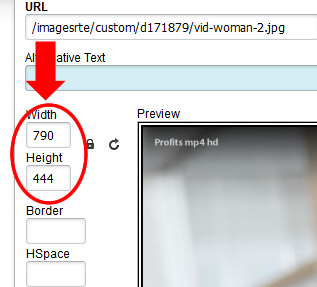
When you have swapped the original image out notice that the width and height values have numbers in them. The editor added those in when you selected the image so that is the problem.
Hopefully this Tutorial has helped you understand how to use Mobile Responsive images within the Power Lead System. Please leave a comment if this has been helpful for you.
